
A pink light can make almost any wall look like Vice City. Turn it off and the building has to do some work.
In Rockstar’s official GTA VI pictures, the work happens in the shape of a hotel front, the height of a motel sign, the space beneath a waterfront building and the low spread of an industrial site. Neon supplies the familiar glow. Architecture supplies somewhere for it to land.
The real comparison runs through several chapters of South Florida building history, rather than one endlessly repeated Art Deco style. Some of those chapters began abroad. Others grew around the American motorist, the waterfront or the mill. Calling all of it Art Deco erases the differences that make the streets worth looking at.
This is a reading of visible features beside documented regional examples. A resemblance does not identify a fictional property as a particular real building, and a screenshot cannot tell us what its walls are made of.
Read the building before the color
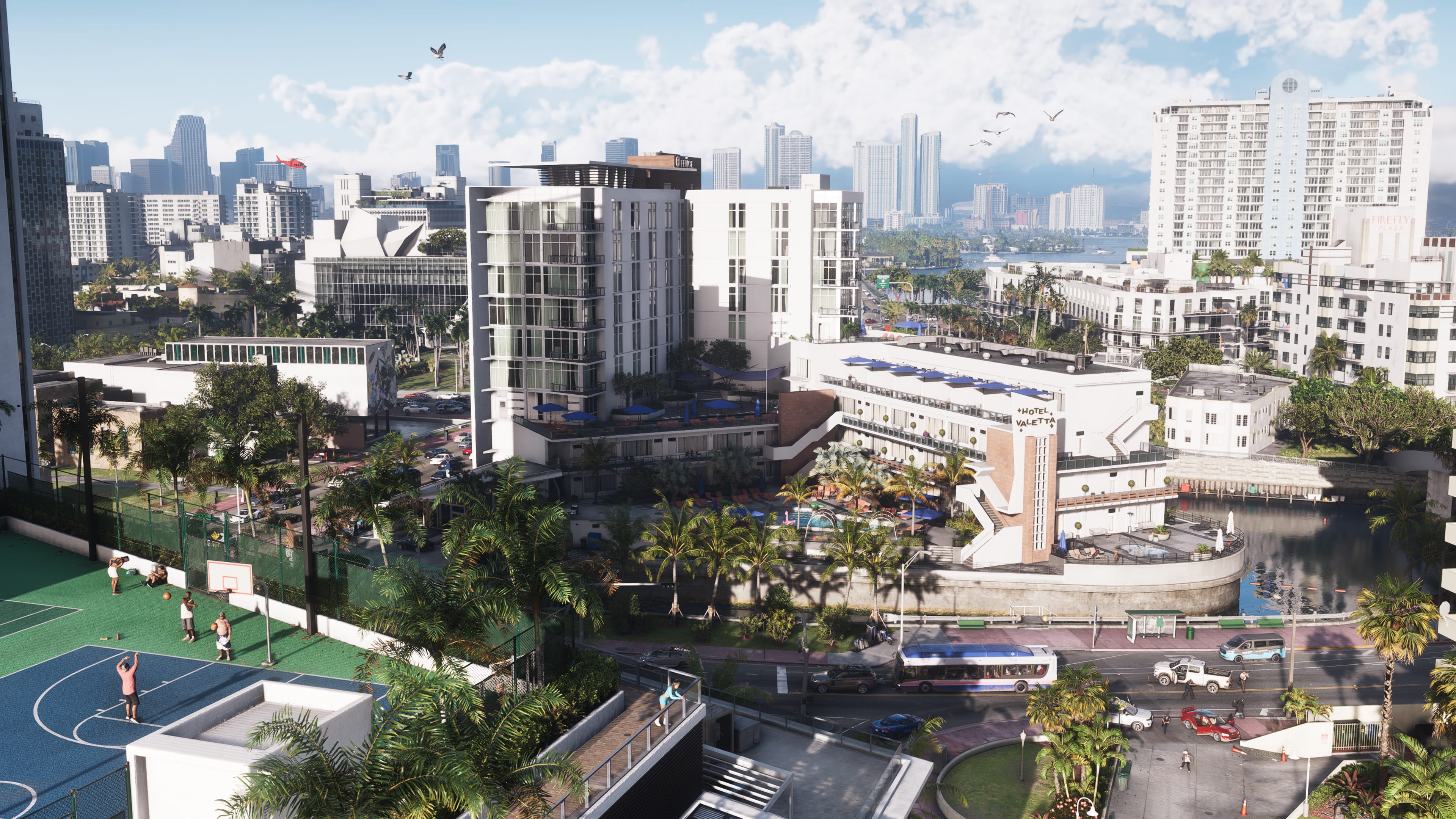
The hotel fronts behind Vice City’s night crowds repay a look above the street: strong vertical accents, repeated windows and bands running across the facade. A bright sign might catch the eye first. The spacing and shape of the building keep it there, giving the crowd a street rather than a wash of pink. Rockstar Games: official screenshots
Miami Beach’s own architecture guide traces Art Deco to Paris and the 1925 exposition. Its local collection developed through the building years of the 1930s, with architects including Henry Hohauser, L. Murray Dixon and Albert Anis. This was an international design language put to work in an American resort city. City of Miami Beach: Art Deco
That distinction strengthens the story. America did not need to invent every shape it used. Builders and designers made borrowed ideas fit a particular street, climate and market. The achievement is visible in the concentration of hotels, apartments and commercial fronts that still lets Miami Beach read as a place rather than a box of unrelated landmarks.
Curves and horizontal bands
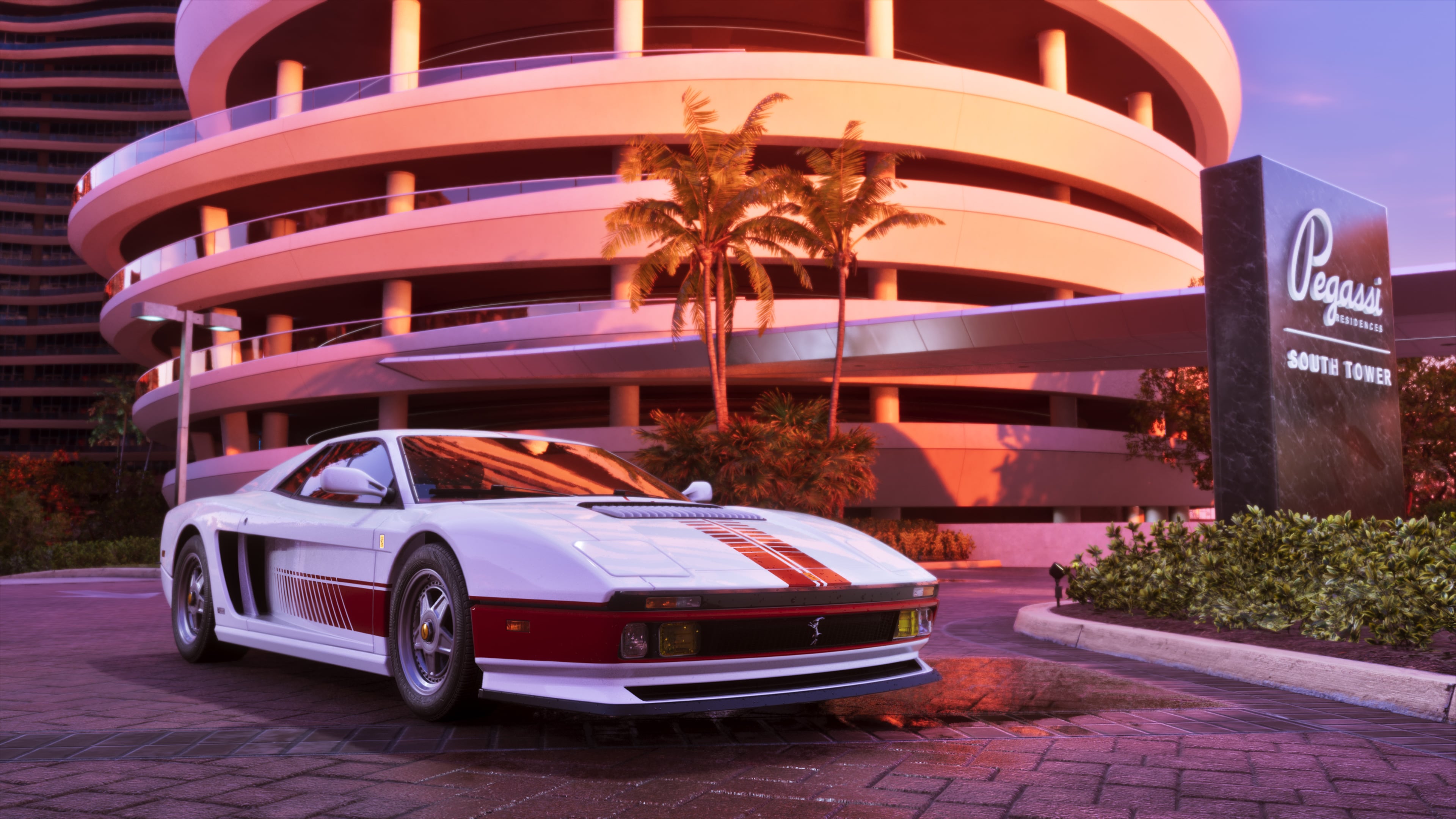
Streamline Moderne is a useful name to keep beside Art Deco. Miami Beach’s guide describes its smooth curves and reduced ornament. It also identifies glass block, terrazzo and neon among the period’s materials and treatments. The relationship between these styles matters more than a rigid game of spotting labels. City of Miami Beach: Art Deco
In Rockstar’s car image outside a rounded, horizontally banded building, the bands are legible even under pink illumination. They lead the eye around the corner. The result feels streamlined before anyone supplies a style label: the wall seems to sweep around the car instead of ending abruptly beside it. Rockstar Games: official screenshots
Look at the whole front. Does the shape emphasize height or movement across the street? Does the corner turn sharply or sweep? Does the entrance have its own projecting cover? Asking those questions is more revealing than sampling the paint. The same building can look severe at noon and theatrical at midnight without changing its basic geometry.
The motel had to catch a driver’s eye
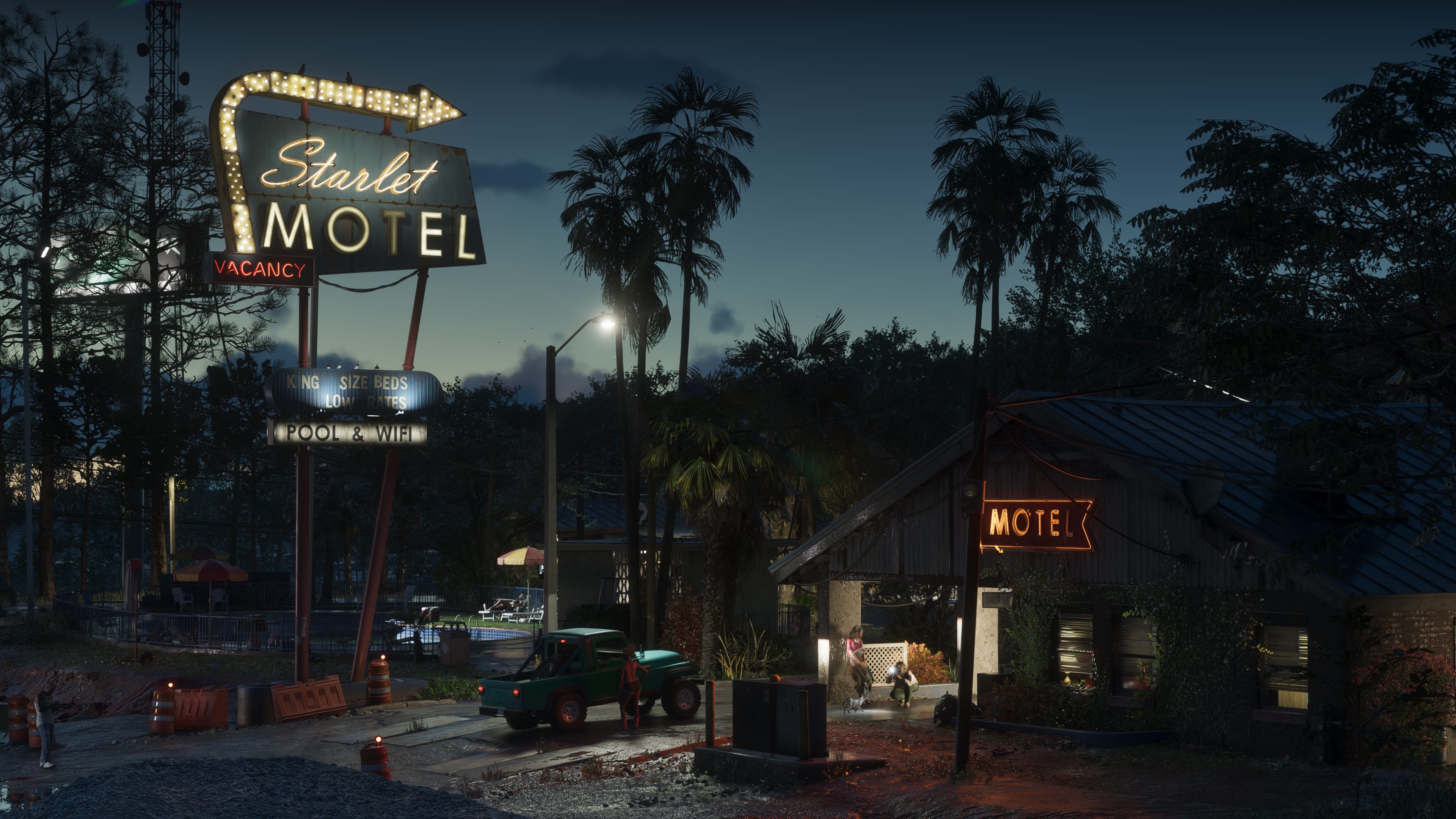
Port Gellhorn’s Starlet Motel sign stands above a low roadside property. A smaller illuminated motel sign sits closer to the building. The picture gives the sign a job: it identifies lodging from the road before a traveler reaches the door. You can understand that relationship without knowing the property’s fictional address. Rockstar Games: official screenshots
Real Miami’s Biscayne Boulevard tells a related story. The city’s historic-district account describes the postwar arrival of motels suited to the car culture of the 1950s. Miami Modern, usually shortened to MiMo, belongs to that later era. It should not be folded into the 1930s simply because both can carry neon. City of Miami: MiMo Historic District City of Miami Beach: MiMo
Miami Beach’s MiMo guide points to projecting eaves, decorative concrete screens, open spaces and bold signage. The screens could admit air and light; the roof and entrance could make a strong silhouette. A building could offer a shaded place to pause while its sign reached out toward the traffic. Port Gellhorn’s tall motel sign preserves that familiar roadside relationship. City of Miami Beach: MiMo
On the water, look underneath
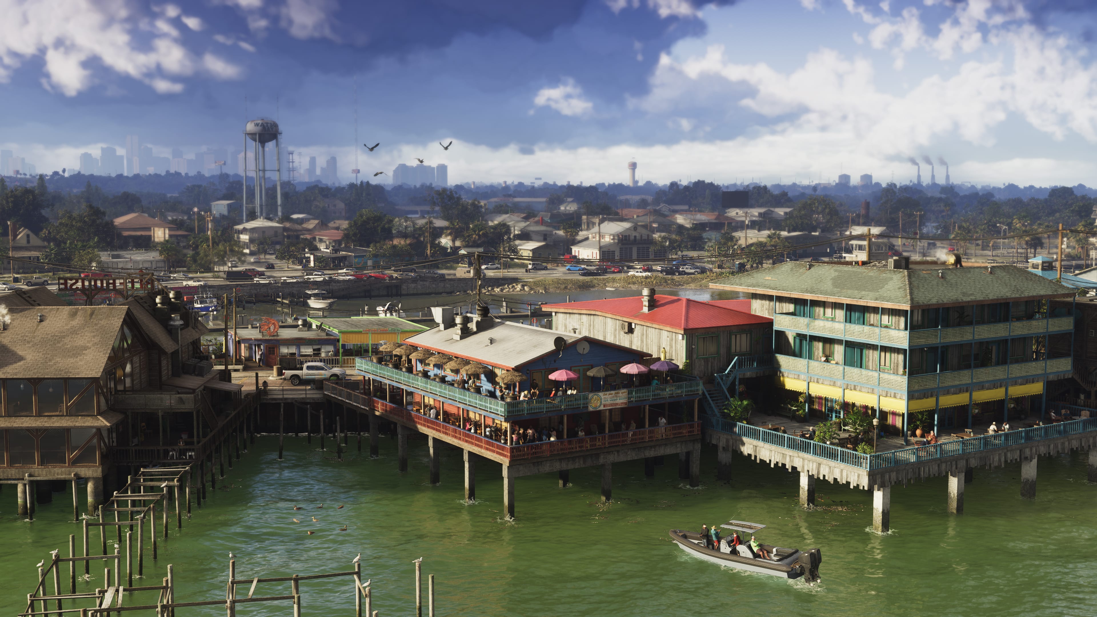

Grassrivers’ waterfront image offers another kind of architecture altogether. Broad, low buildings stand on supports above the water, with open space underneath. Roofs and decks spread horizontally. Here the useful question is how a building meets its site, rather than which decorative fashion owns it. Rockstar Games: official screenshots
Stiltsville, in Biscayne Bay, is a real South Florida comparison. The National Park Service describes a settlement beginning in the 1930s with structures raised over shallow water. Hurricanes, fire and exposure repeatedly reduced their number. Raising a floor creates a striking view, but it does not make a building invulnerable. NPS: Stiltsville Seminole Tribe of Florida: Chickee
A raised floor is a building decision, not a complete cultural identity. A Seminole chickee, for example, belongs to a specific Indigenous tradition of palmetto thatch and cypress framing. The name should not be casually pasted onto any roof on posts. South Florida contains several ways of building with air around and beneath a room; their histories deserve to remain distinct. Seminole Tribe of Florida: Chickee
A newspaper building became a place to begin again
Real buildings also acquire meanings their architectural style cannot explain alone. Miami’s Freedom Tower began as a newspaper building in 1925 and later housed the Cuban Assistance Center. Its design draws on Spanish and Italian sources, including Seville’s Giralda. Its American significance includes the practical work of helping refugees begin new lives. NPS: Freedom Tower
The mill gets a skyline, too
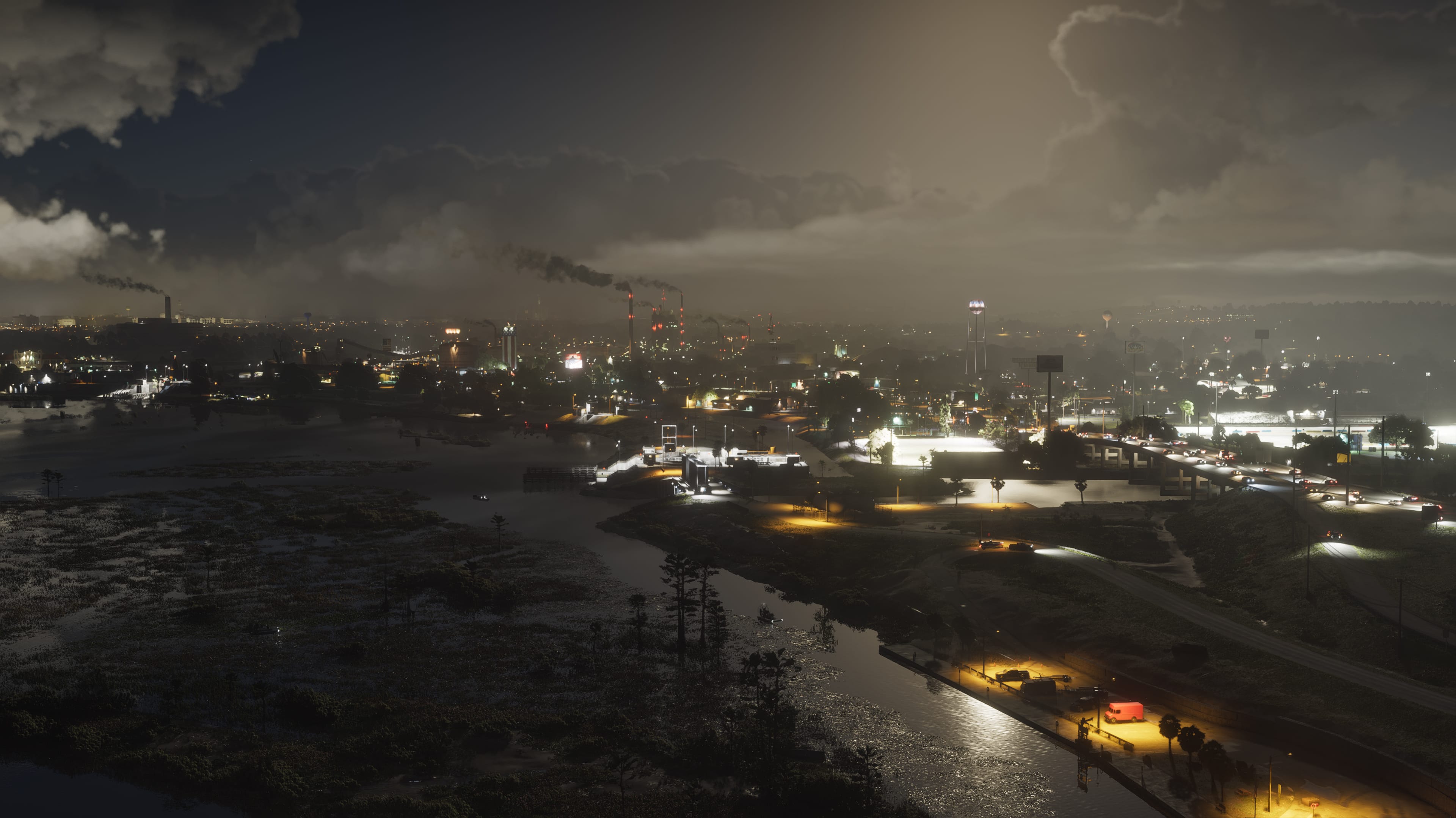
Ambrosia’s industrial views bring utility towers, plant silhouettes and long low structures into the frame. They work by accumulation: equipment, wires and a broad footprint rather than one decorative hotel front. The horizon belongs to the site as a whole. It changes the view of a state so often introduced through a single strip of beach. Rockstar Games: official screenshots
The historical comparison with Clewiston is well grounded. Its National Register documentation connects sugar production with the growth of the town and records a mill opening in 1929. It also describes the Clewiston Inn as a 1938 Neoclassical Revival hotel. Even an industrial town contains more than industrial buildings; business and social life need rooms of their own. Clewiston Inn National Register nomination
For Vice City and the region around it to hold our attention, these ordinary changes of purpose matter. A motel should address the road. A raised waterfront building should make us notice the water. An industrial district should have a different scale from a beach block. Rockstar’s published images give us grounds to look for those distinctions. They do not yet justify a verdict on every street in the game.
Neon makes an excellent first impression. It cannot carry an entire city.
The deeper pleasure is recognizing a building that has something to do: give a traveler a bed, shade an entrance, lift a room over the bay or make space for work. South Florida’s architecture has done those jobs in several styles and under difficult conditions. Its surviving buildings are worth preserving and understanding on their own terms. If GTA VI sends more people looking past the glow to the shape of the street, that is a worthwhile trip to make.
GTA VI images © Rockstar Games. Stiltsville photograph: NPS/Matt Johnson.


